Friday, 8 October 2010

Music Graphics research

I have Just come across the work of Non-Format and it has blown me away to be honest. Usually when I check out a studios portfolio there is only one of two pieces of work I really love but Non-Format have produced a vast amount of amazing work. It is exactly the sort of work I wish I was making, and looking at their approach to various briefs will be an incredible help for my own brief to design for a band.

Just a few of the works that wowed me,


David Bowie poster, nice use of custom type and clever use of mixing desk sliders to represent information.


Milky Disco Three, Again great use of custom type as image


Just amazing, Smoke, rabbit, explosion, I might as well give up now: (click to enlarge)

Thursday, 30 September 2010

just a piece of work I liked today

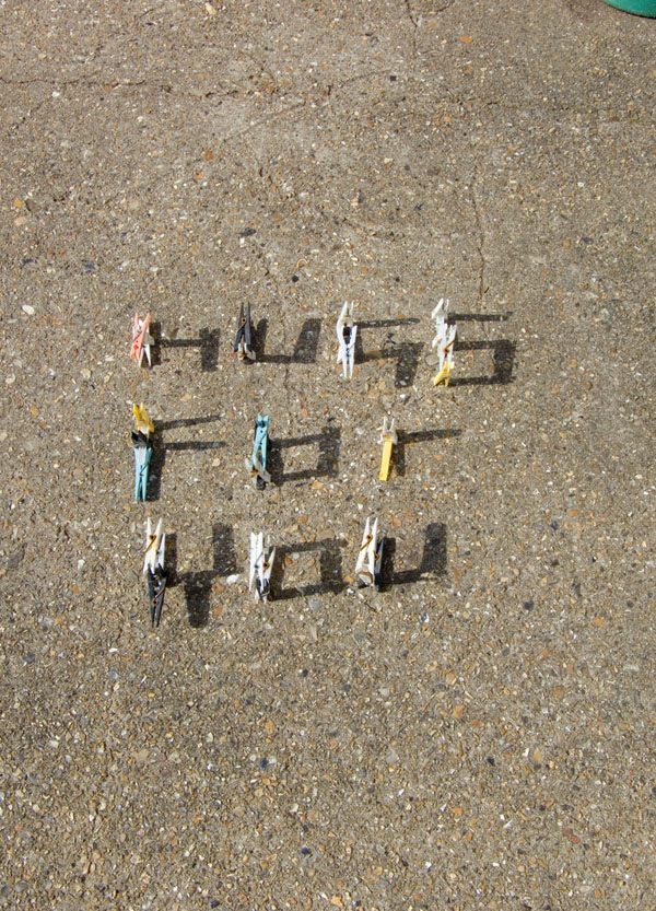
By Ethan Park , Nice idea this for found object typography, its part of a bigger project, and he has experimented a lot photographing different objects as type but this piece was the most successful I felt.


Thursday, 27 May 2010

Ministry of sound motion graphics

The first bit of research I did for this brief was finding past motion graphics for MoS. As expected there is tons,


This is a nice concept for a terrible CD.


rave visuals have the right feel but not a very memerably piece


Stunning!


Nice use of colour here, a much more quality, expensive feel to this.

I could go on, I think over the years Ministry has probably used every graphic style and trick there is. They have produced good stuff but some awful tat as well. There has always been a lack of consistancy in the quality of products they allow their brand on to, this is clearly reflected in the graphics.

Sunday, 28 February 2010

Engage Mutual Research

Ok this it pretty dry stuff, but I have decided to make a determined effort to actual blog things that I have looked for this brief, We shall see how this goes..

First up, some links. I have been looking at other Mutual insurance/assurance companies websites for some ideas and inspiration and to compare to Engage Mutual's own site


Uk sites

World

The main thing I noticed was that none of these companies make a big thing about the 'mutuality' This is something that Engage Mutual wants to do looking at the YCM brief. The design of the sites are very plain apart from the LV site. LV has a far stronger branding and logo than the rest. Engage Mutual have used lots colours on the home page, I feel they should stick to the colours in the logo plus black white and grey as LV have done.


Another thing I found: searching Youtube I found a TV advert from Engage. This is sadly the only motion graphics relating to the company I could find.
Its a bit 'daytime telly' if you know what I mean, I wont say anymore.


Tuesday, 2 February 2010

DVD menu research

I have had a look round the net to learn a little more about putting these together. There is a lot you can actually do in DVD studio but I feel I cant really get to know this in depth right now as I am already learning as much as I can with after effects. Defiantly something to come back to and explore more in a different brief. Anyway this is a good read: http://www.computerarts.co.uk/in_depth/features/dvd_menus  A bit short of pictures but some good insights into professional production.

Tuesday, 26 January 2010

TCM Idents

For a bit of research I looked at some existing TCM idents, as I plan to base my own on a film season for this channel. They use quite a clean look in all there own graphics. Even better, they like to have text moving around in 3d (even on the menus os the website (http://www.tcmuk.tv/) this is great because I want to use 3d in my own idents and I am thinking these will be mostly type based.


This is one from about four years back, I like how this is technically very complex but restrained in its treatment. Black and white is a bit of a short-cut to making something look classy but it works well here. This succeeds in mixes classic stye with contemporary aesthetics which is what they were after I would say.


This one is a good example of the 3D text thing they like that I was talking about. I dont really like the layered style over the top of this one. I would have left that out.


This is a newer one. You can see they have gone upmarket, almost to the point of being a little pretentious here I would say. Again nice 3D text used in the logo graphics.

For me own I want to add a bit more energy and swagger (it is gangster season after all).

Saturday, 23 January 2010

More Kenetic type stuff

Now I have decided to base my Movie Season brief around film quotes I have had another look at kinetit type for a bit of inspiration. I have come across a great blog posting with some awesome examples.
click here

The stand out ones for me are this Alex Gopher vid. Amazing!


I also like this because it is so polished and fast paced, not so origional but done very very well.


I am glad I found this one as well because it is an actual ident for a TV channel, again, fast paced and very well done.